About the company Wrk
Wrk is an all-in-one automation platform for businesses. The company provides a unique solution to the clients automating their end to end business processes, and in doing so, improving their efficiency of operation and reducing the cost. It leverages latest technologies like AI, API, Browser automation including humans in loop in order to achieve their objective.
What the project is about?
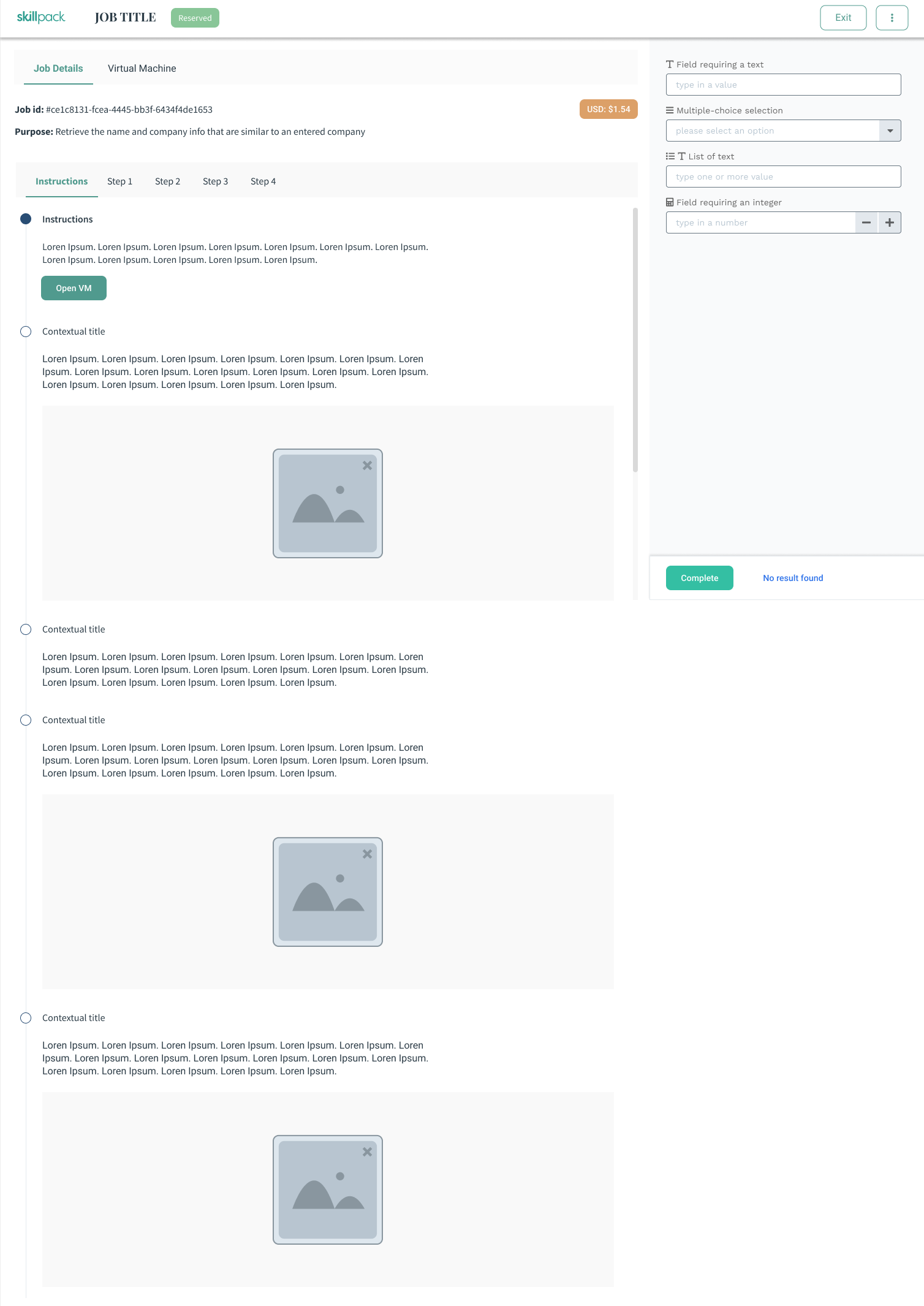
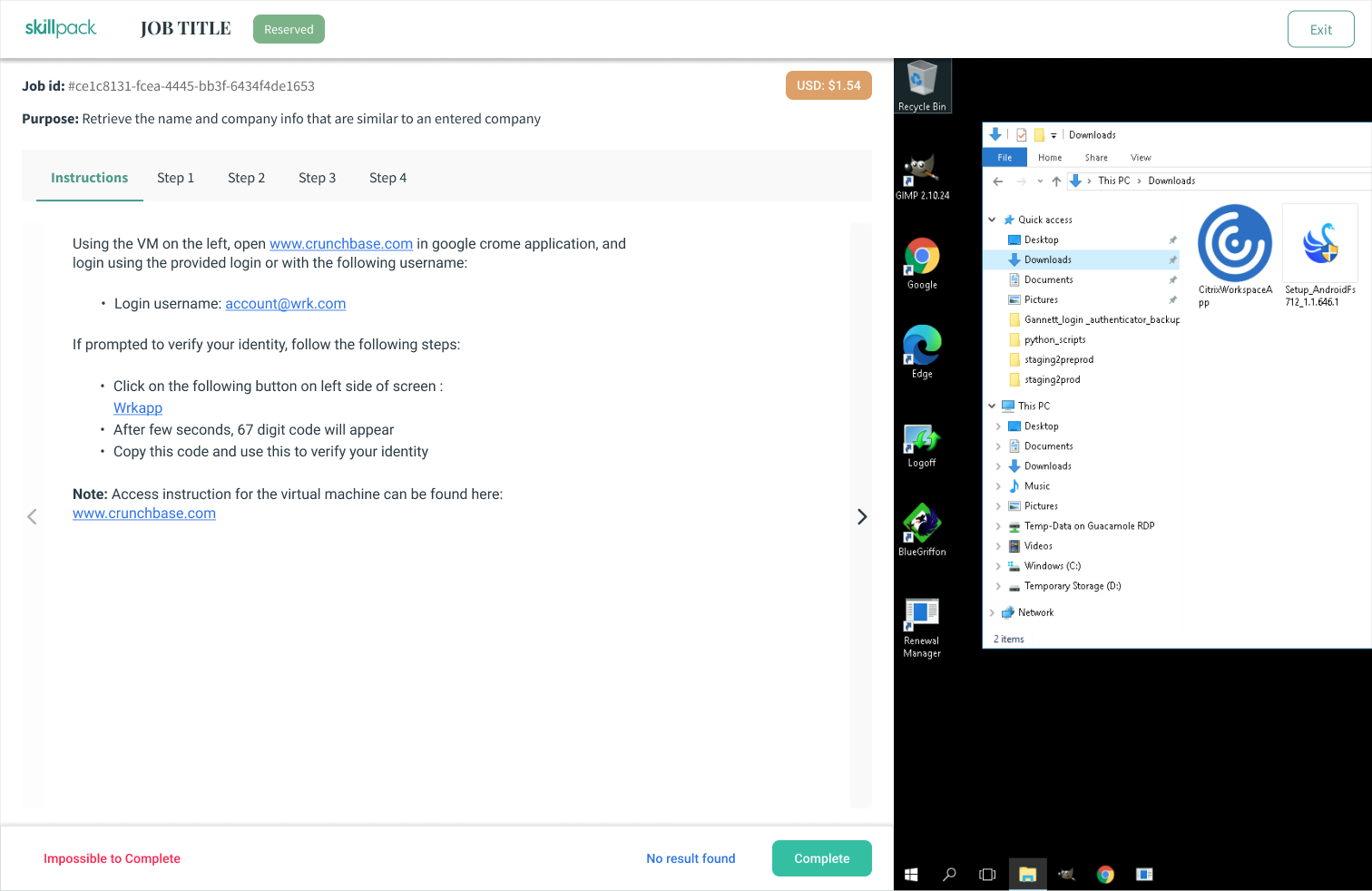
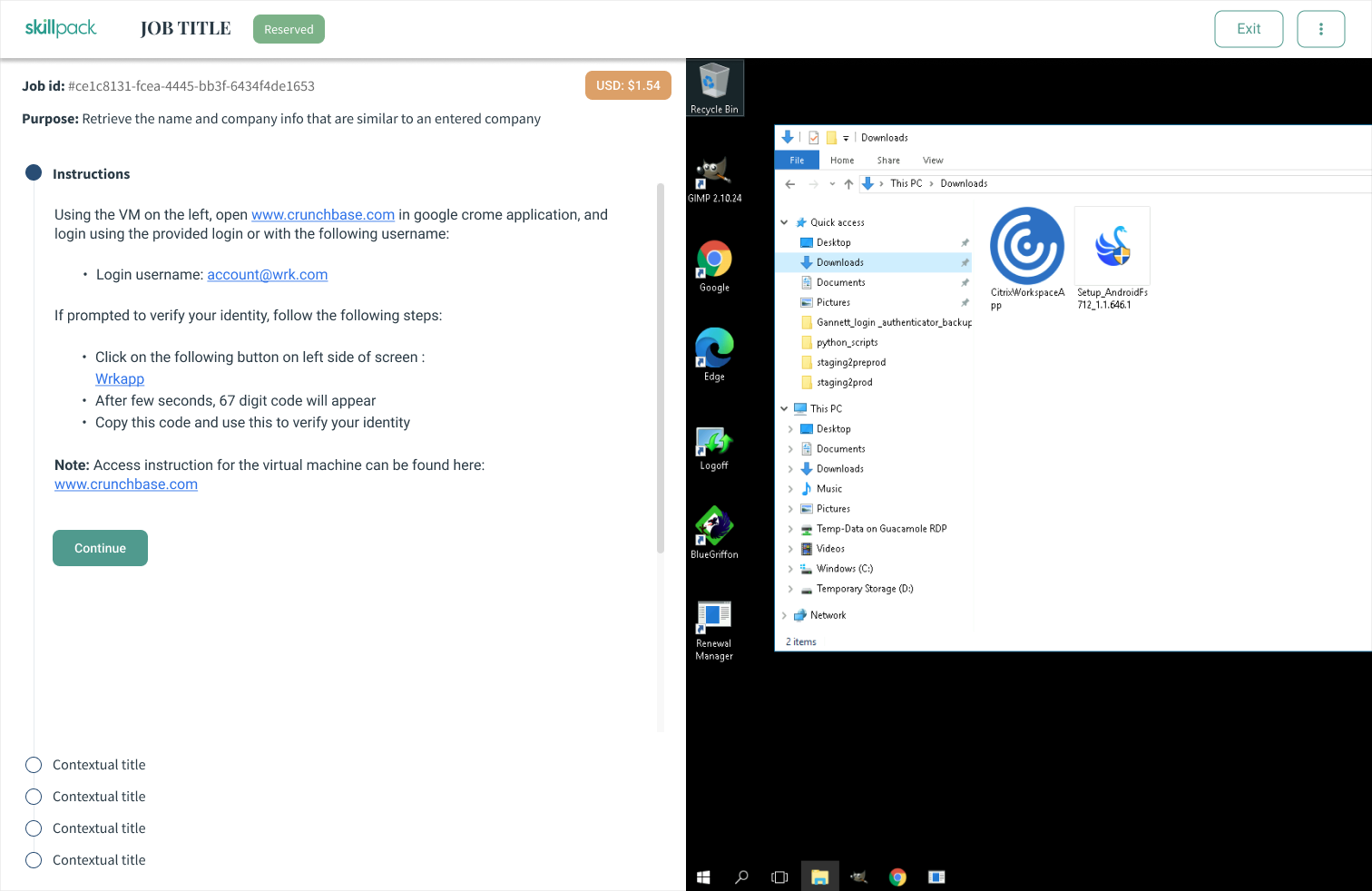
The objective of the project was to redesign a critical feature of the Product called Wrkstation, that allows users to pick and finish the task/jobs more efficiently and error free; improving the overall quality of results generated by the automated workflow for the businesses.
My role
As a sole designer in the company, I led the user research, crated wireframes, and finalized high fidelity designs that is feasible and must meet user and business objective.
There were many problems - identified by user research
In order for the workflow to complete the automated processes, the minute task generated need to be completed as soon as possible, includes the jobs done by users. However, with the current implementation, there were many problems that were not allowing them to be fast and efficient. Based on the analysis, user interviews, and feedbacks, in collaboration with the product manager, the following problems were identified:
- There is no proper structure of information within the page which leads to more time reading and identifying the work.
- No hierarchy of information, creating readability issues.
- Too much information, increasing the cognitive load and thus decreasing time it takes to finish the job.
- Scattered information.
- Unintuitive form without a proper guardrail of accepted information
- Lack of feedback on the incorrect information within the form
- Hidden information that are critical for the users
- Unclear actions
Goal
Based on all the insights gathered and problems identified, the following goal were set with the redesign of the application, in collaboration with the Chief Operating Officer (COO):
Time to complete design - Maximum 2 weeks.
- Allows users to complete their job efficiently and efficiently
- Provide guidance on the steps they need to take
- Declutter and reorganize the information to reduce cognitive loads
- Update forms with proper guardrails and helper text
- Bring key information upfront that is valuable to users i.e. pay, status, time, etc.
- Design for all targetted user personas
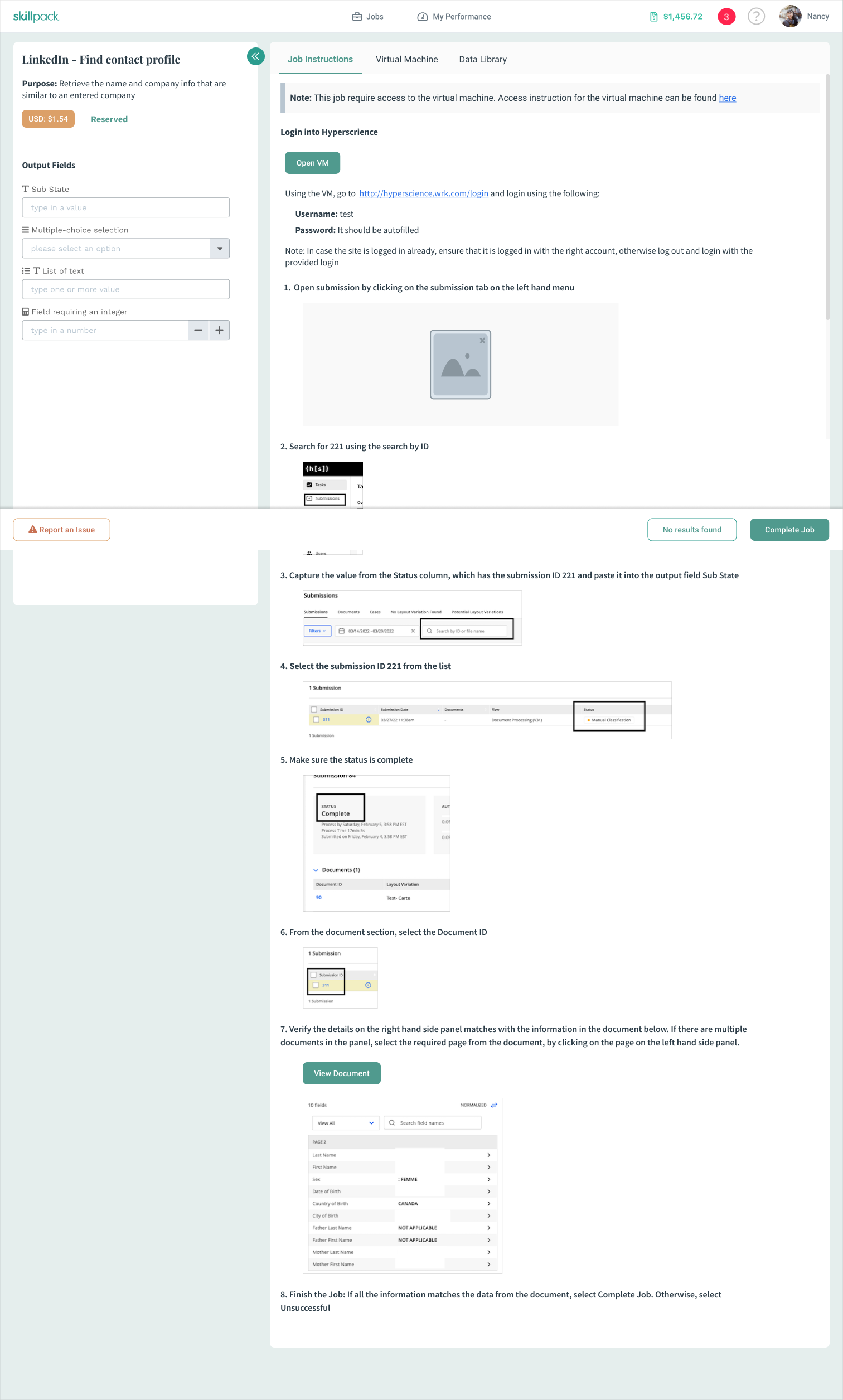
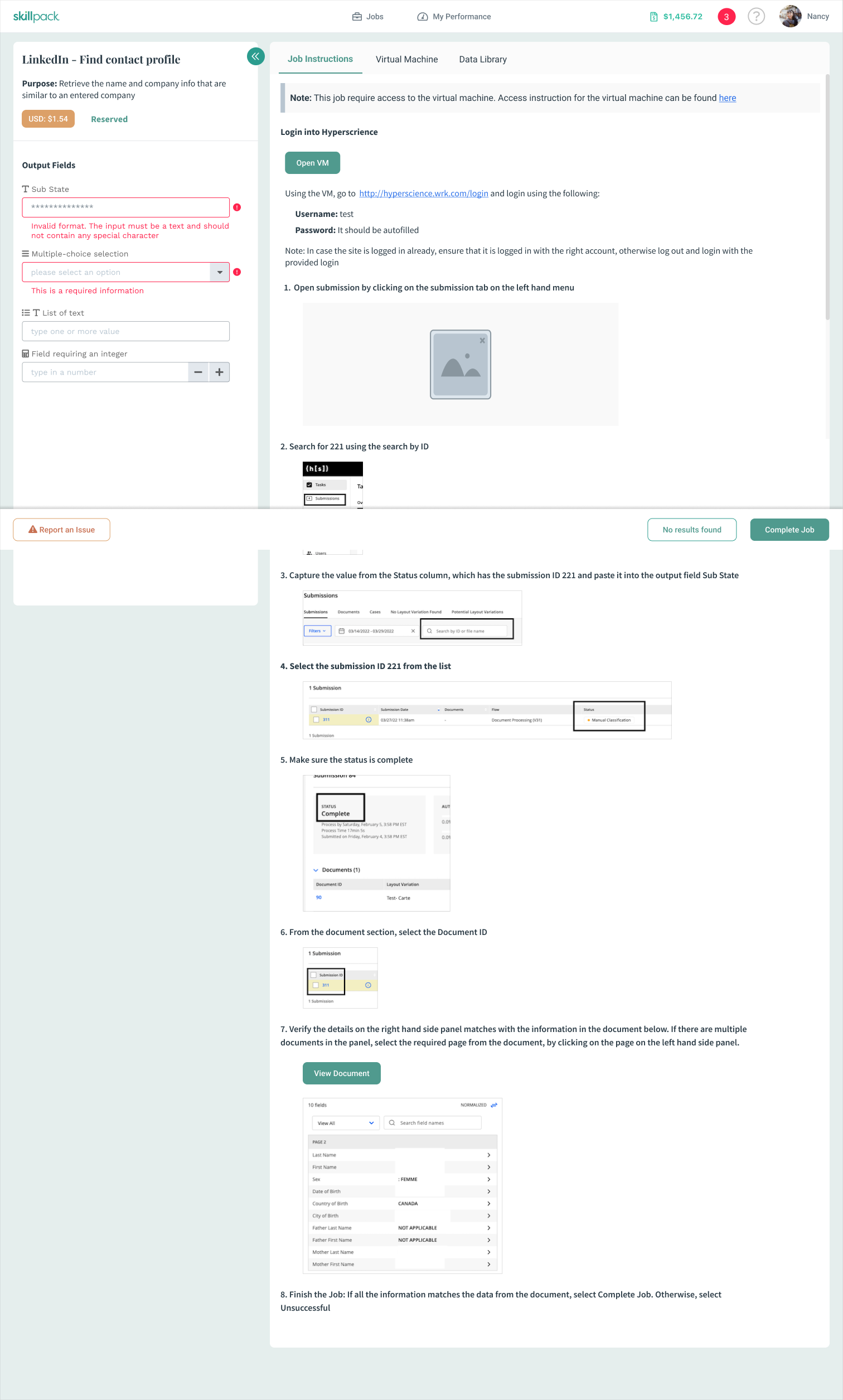
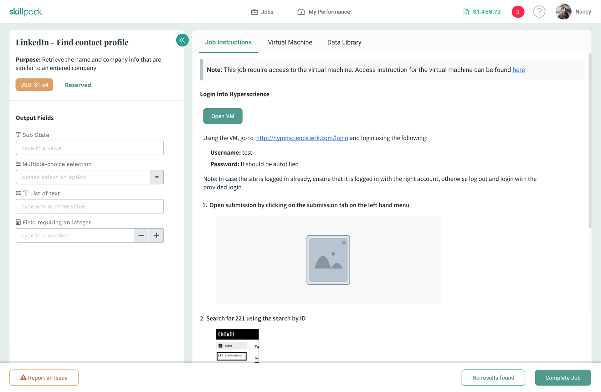
Old Implementation - Not intuitive
The highlighted numbers shows the different problem areas that were discussed earlier.
1. Unclear tabs and usage
2. Hidden status, super crucial for users
3. Confusing actions
4. Forms - BIG PROBLEM
5. Too much information in undigestible manner
It's time to go back to the drawing board
Keeping the goal and problems in mind, I designed a low-fi high level few concepts, that improves the experiences and solves the pain points.
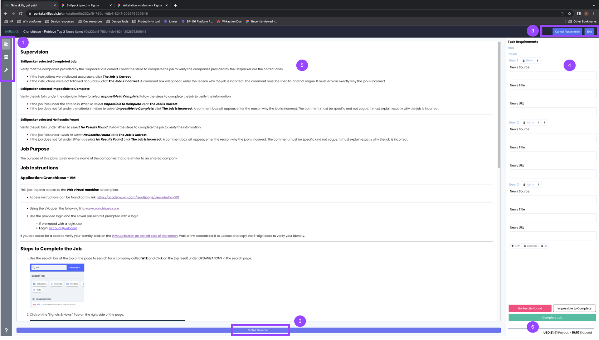
Wireframes
Using the Low-Fi ideas, within couple of days, I created the wireframes with 3 different concepts and presented to the respective stakeholder including executives. Additionally, I did the user testing to gather the feedback from the users.
The mid-fidelity designs are shown below:

It's hard to reach to users and gather feedback within time
I wanted to test the concepts with the actual end users. However, due to tight timeline and user base across the globe, it was difficult to get hang of them so quickly.
Hence, I did the user testing with some internal users based on two groups:
- One who users the product and interacts with the users
- Second, one who never uses it and are new (for fresh perspective)
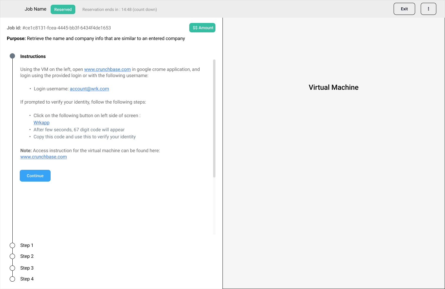
Bravo!!
The design was well received upon testing. The preferred design was achieving the following objective, which is exactly what we needed.
- A guided experience on the steps that the Skillpacker need to take in order to complete the job, that reduces the cognitive load, provide clear contextual information at each step.
- Related information or plugins like virtual desktop available only when it's necessary, reducing the load time upfront as well as providing a more guided experience.
- Redefine the content and it's structure to improve the readability for the users.
- Clear CTA to complete the job or report some issue
- Highlighting the key information upfront, reducing the clutter.
But it was shooting for North star - so not feasible
After the review with stakeholders and developers, we realized that the approach will require way too much work and time on the technical side in order to achieve the end result. There were so many new foundational element need to put in place, architectural changes needs to be done, which makes it super long project. Hence, the designs were not feasible to implement in the targeted timeline, which was always ASAP for startups.
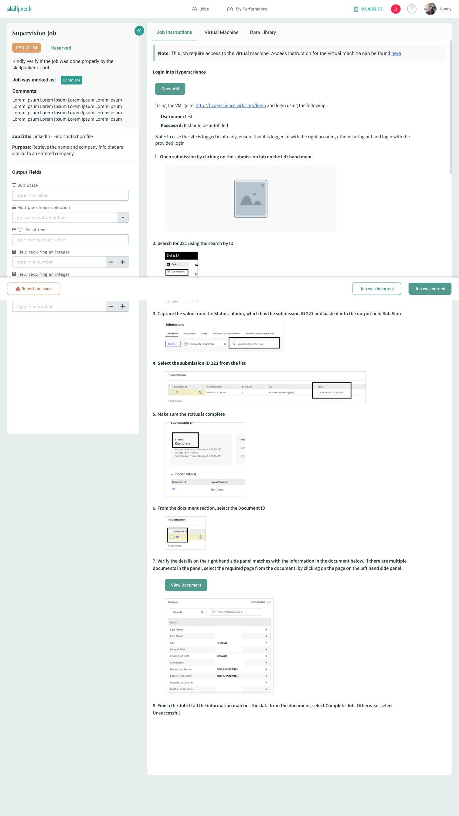
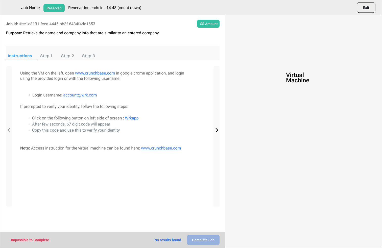
The new design
Upon receiving the feedback, I spoke with developers and understand the better feasibility aspect on the way system works, some aspect of backend architecture, and feasibility. With the better understanding on things and knowing the users preferences, I optimized the design with the following goals, keeping the user experience intact:
- Reuse as much of the component as possible with small modification - Quick way to modernize with branding without changing too much
- Optimized the information structure with the help of Markdown, without the need of changing the way they behave - good way for creating hierarchy and structure
- Update the forms - It was must and couldn't compromise
- Keeping the same functionality with small tweaks on button copy, accessibility of it, layout, will make it some work but easily achievable.
The end result
The final design below, after performing user testing and reviews with stakeholders and developers, marks all the checkboxes, improved overall targeted user experience, efficiency, and quality of work.