About the company
Wrk is an all-in-one automation platform for businesses. The company provides a unique solution to the clients automating their end to end business processes, and in doing so, improving their efficiency of operation and reducing the cost. It leverages latest technologies like AI, API, Browser automation including humans in loop in order to achieve their objective.
My role
As a lead designer, I led the end-to-end design process, from research to creating holistic user experience strategies. These strategies are crafted in collaboration with Product, Executives, Marketing, Technology, and cross-functional teams like Support, Sales, Customer Success to meet immediate needs. Additionally, I was responsible for analyzing user interactions post-implementation and suggesting solutions with the goal to improve user conversion and quick signup.
Problem statement
At Wrk, we were using security standard OAuth2 technology that allows user to quickly signup using email or password or SSO. Using the technology has many advantages i.e. following the security best practice, securely storing and fetching the user credentials for signing in and signing out from the platform.
However, there were drawbacks:
- The UI of the implementation looks buggy
- Many important elements being hard to access and read
- random account creation without any user information
- Lack of information about people signing up, which was crucial for the businesses to define it's target audience.
- The UI of the implementation looks buggy
- Many important elements being hard to access and read
- random account creation without any user information
- Lack of information about people signing up, which was crucial for the businesses to define it's target audience.
What success looks like (Goals)
- A quick and modern Signup/Signin flows for the user onboarding
- Mobile support / Need to be responsive
- Have some key information from the users for analysis of persona
- Centralized data system for user signing up with information
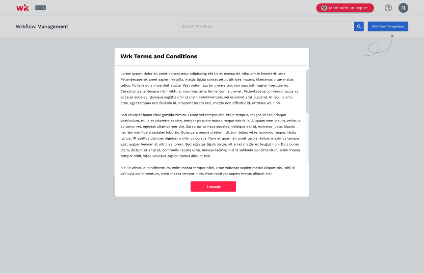
- User need to explicitly accept the T&C's (Legal & business need)
- Mobile support / Need to be responsive
- Have some key information from the users for analysis of persona
- Centralized data system for user signing up with information
- User need to explicitly accept the T&C's (Legal & business need)
There are always some constraints
The OAuth2 provides, although with tons of values, also comes with tons of constraints and limitation as follow:
- Very Less flexibility on redesigning the process
- Rigid process for user creation and validation
- Lastly, from business and system side, in order to create an account, we needed some upfront information based on which the account was created for that users.
- Very Less flexibility on redesigning the process
- Rigid process for user creation and validation
- Lastly, from business and system side, in order to create an account, we needed some upfront information based on which the account was created for that users.
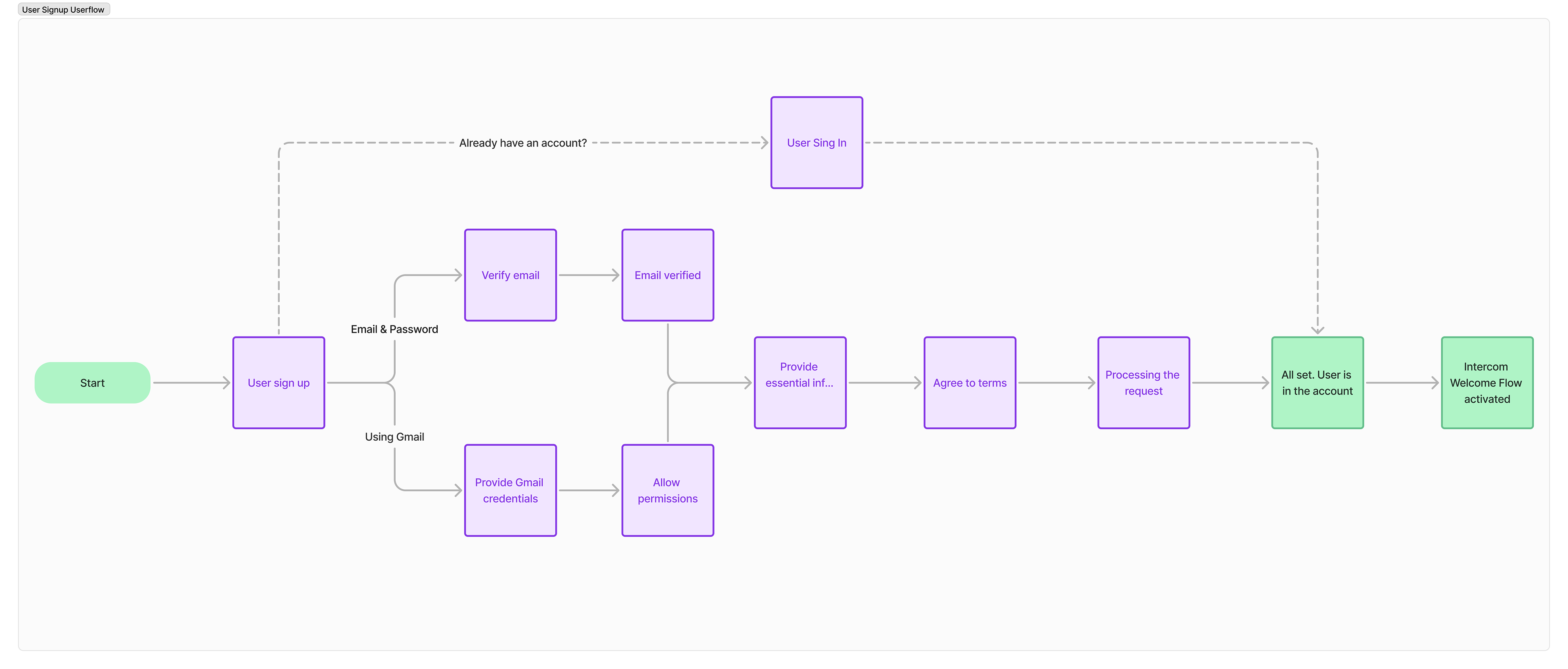
Let's define the Userflow
Based on my research and understanding of OAuth2 limitations and flexibility, understanding on the architecture in place from technical side, business needs as well as goal on going to market in shortest time possible, I crafted high level user flow diagram for the process as shown below.
Most of the heavy lifting has been done by OAuth2, but there were much more to achive holistic experience i.e. connecting with intercom for user welcome flow, firing a message with all the information provided to slack, notifying internal team as soon as user signs up, integrating with Fullstory and Hubspot, etc. However, just to simplify and provide high level core steps within the product from user side, I crafted the following userflow.
Most of the heavy lifting has been done by OAuth2, but there were much more to achive holistic experience i.e. connecting with intercom for user welcome flow, firing a message with all the information provided to slack, notifying internal team as soon as user signs up, integrating with Fullstory and Hubspot, etc. However, just to simplify and provide high level core steps within the product from user side, I crafted the following userflow.
There is always more than 1 way (Wireframes)
Following the approval of the flow, I crafted two mid-fi wireframes that highlights the flow and is adaptable for the feasibility, technology, and intuitive for the users, which are also industry standard. However, one is much more feasible but blank than the other, given the urgent need of getting out the door as soon as possible.
Concept 1
Concept 2
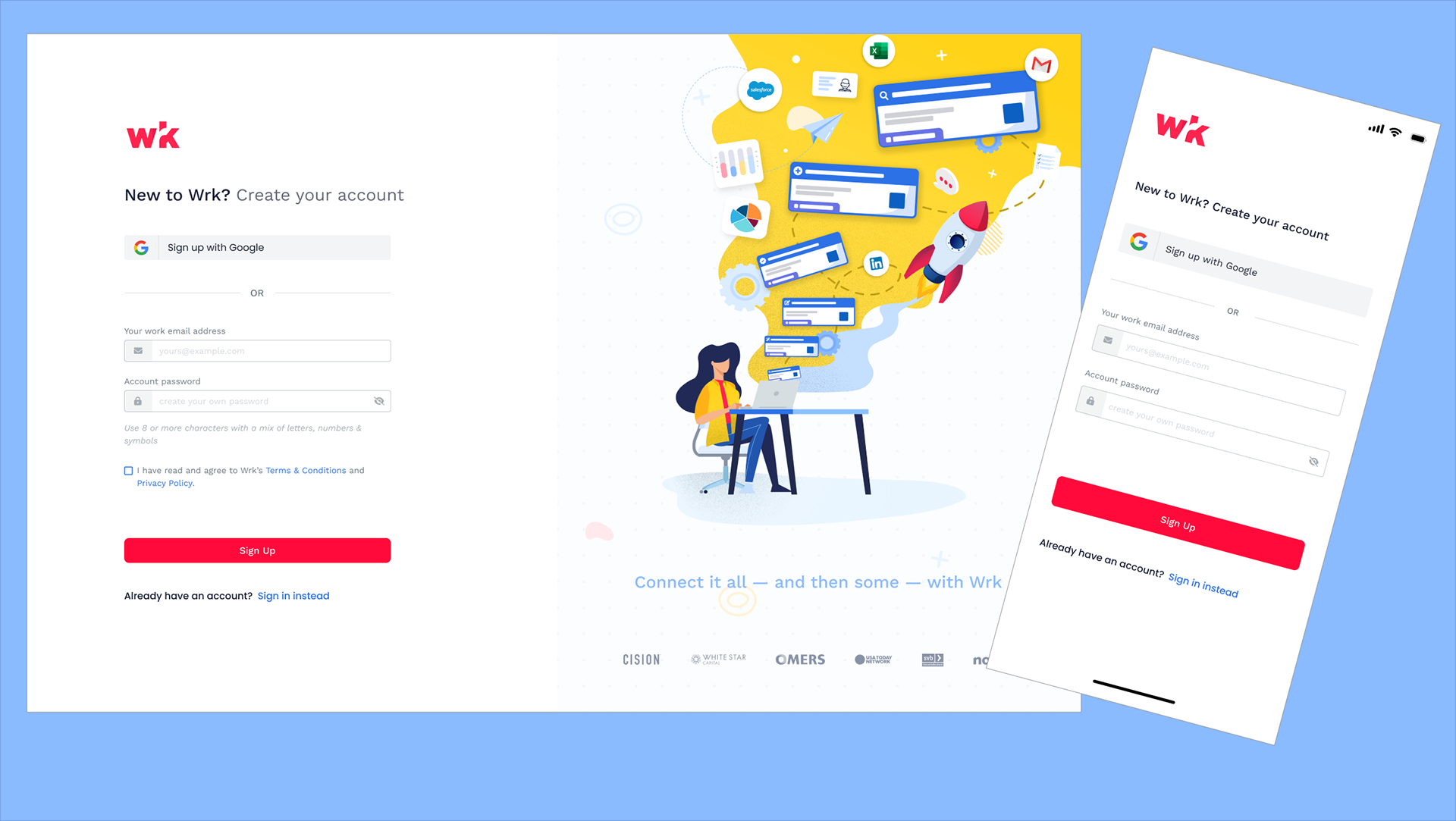
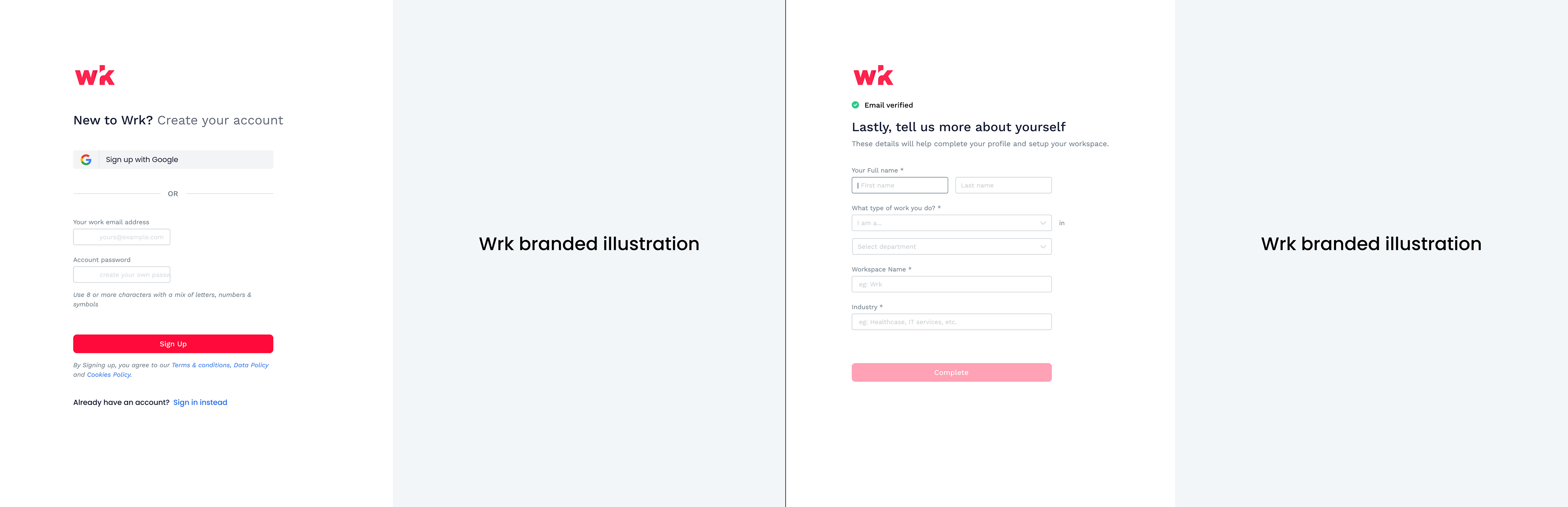
The winner of iteration 1 - Final designs
Upon analysis of stakeholder feedbacks and some user interviews and feedbacks, we decided to move with the concept 2. Upon approval, I crafted the high-fidelity designs along with all the details and user interaction to have final feedback and analysis. Additionally, I collaborated heavily with Marketing team and graphic designer of the company to finalize those illustration and copy.
Important note: the flow is responsive and mobile friendly as well.
Important note: the flow is responsive and mobile friendly as well.
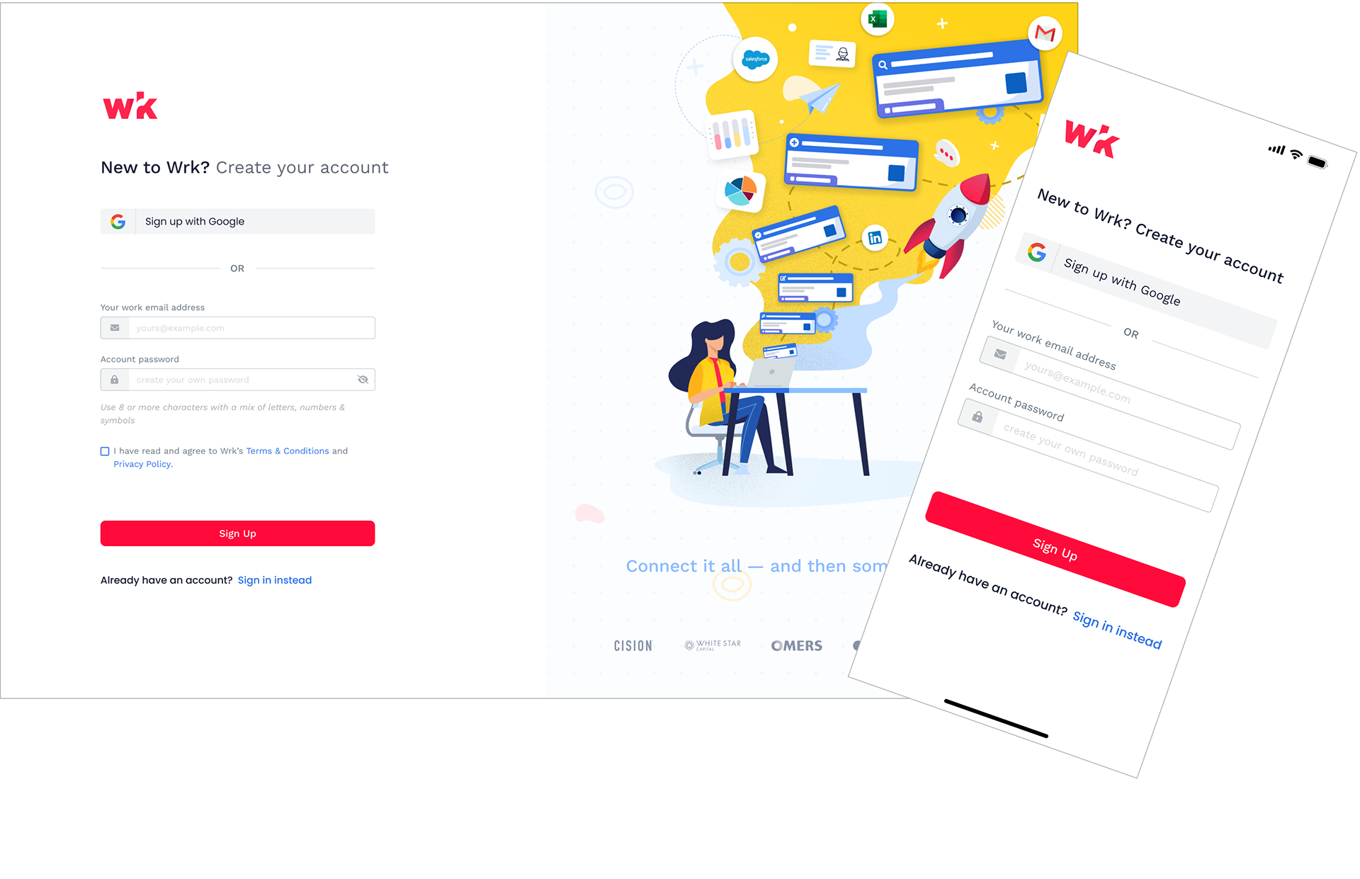
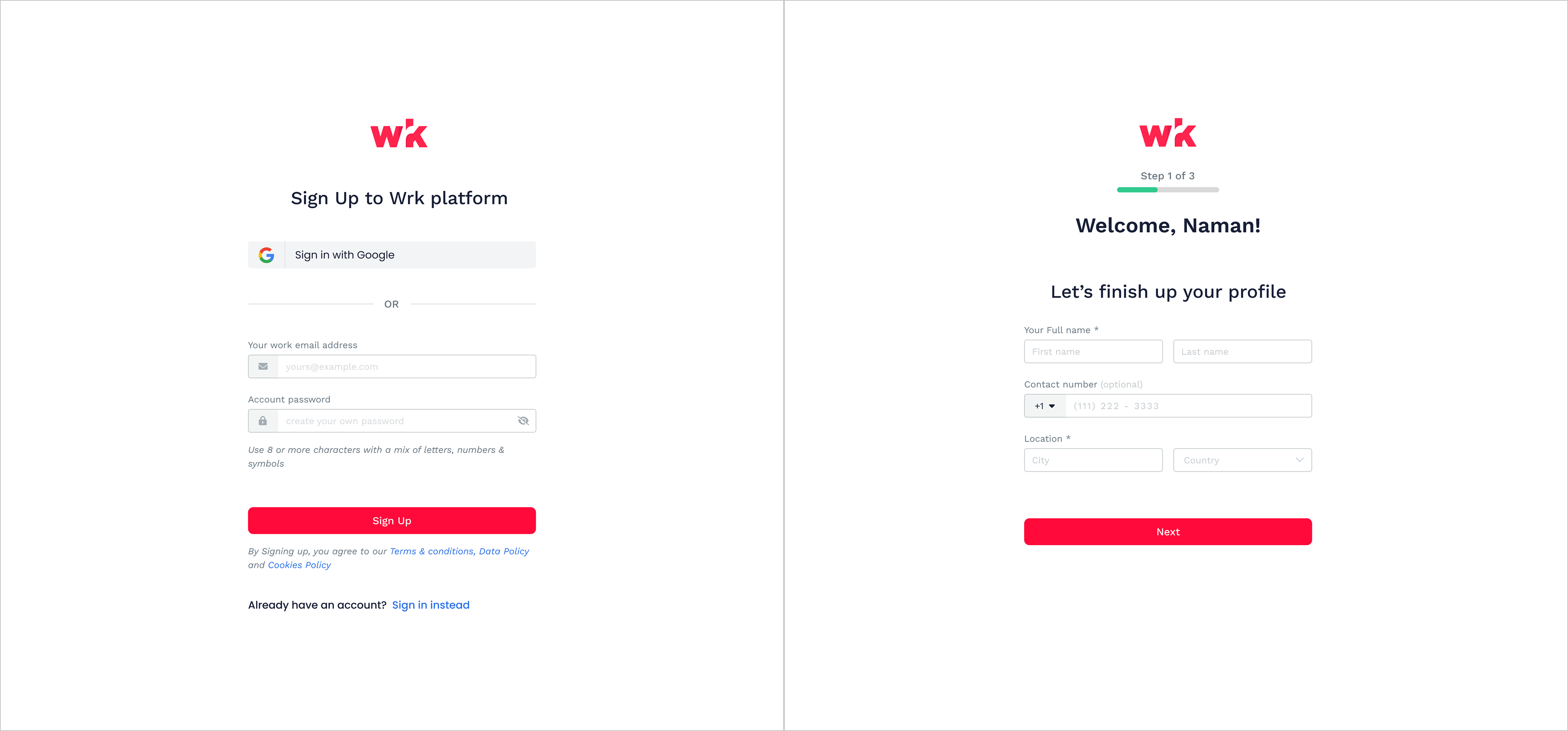
Sign Up
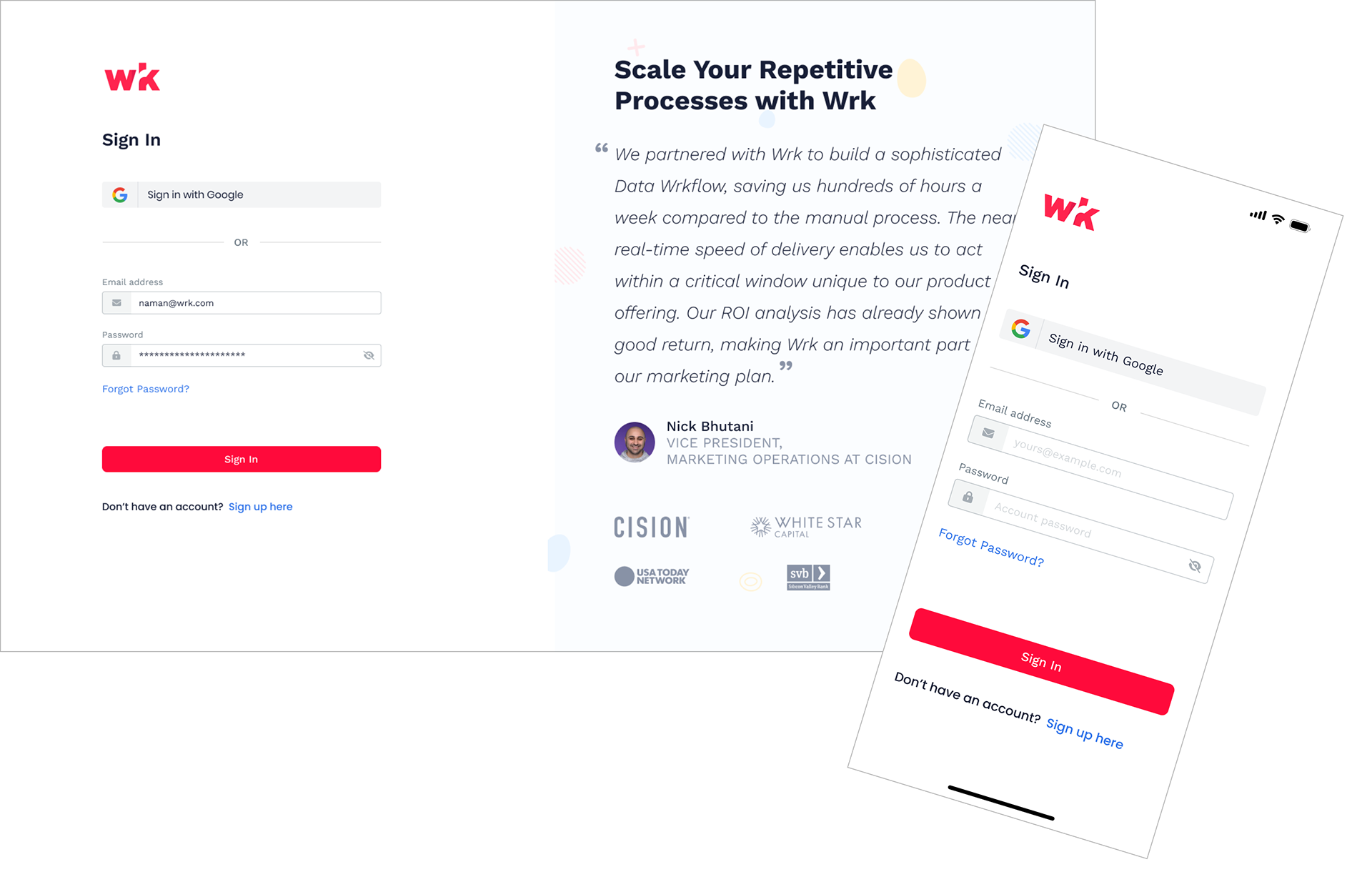
Sign In
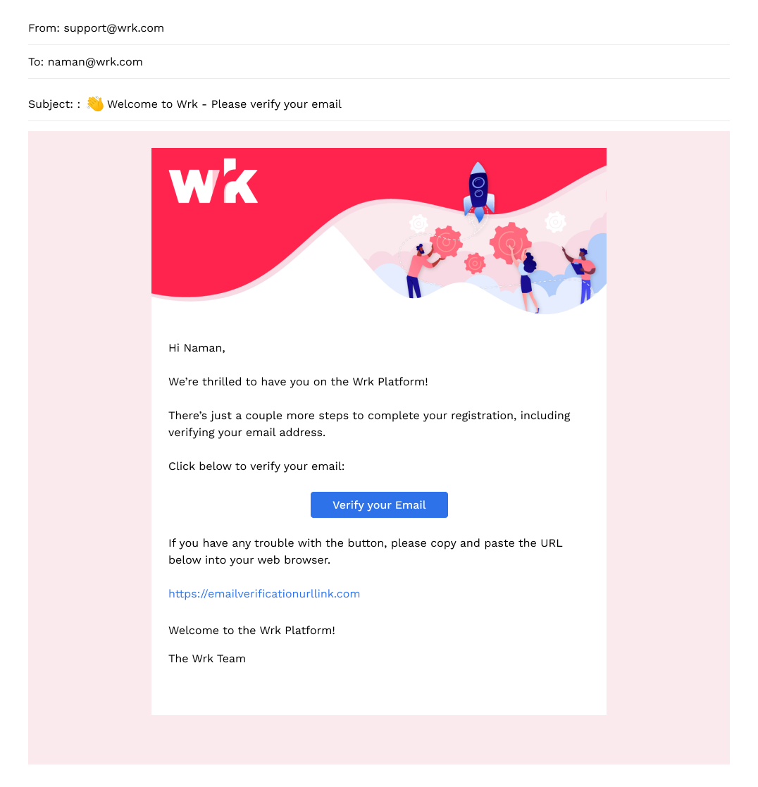
HubSpot - Branded Verification Email Design
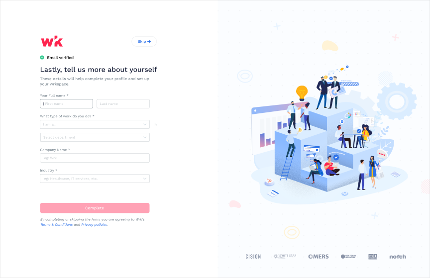
User started dropping
Once the design is being developed and out the door, we got some great feedbacks. However, upon further analyzing the user sessions through tools like Fullstory and feedbacks for some time, we realized users have started dropping and don't finish the process of account creation from Information page.
It's not easy to remove that page
With some additional thoughts and discussion with stakeholders, we align on the goal on making it reactive rather than proactive on getting those information from users and simpliofy the signup process. However, it was not that simple. There were few catches:
- The information is must for the system to finish setting up their account
- The approach to make that chance requires a lot of technical effort and time, hence use of resources
- It's still crucial for the business to get the information from the users for Target user validation.
- The information is must for the system to finish setting up their account
- The approach to make that chance requires a lot of technical effort and time, hence use of resources
- It's still crucial for the business to get the information from the users for Target user validation.
Optimizing the signup - Phase 2
Based on the user research and keeping in mind on business need and end goal in mind, we understood a need for allowing user to skip the step if needed as an intermediate solution, hence allowing them to navigate that step if they want to and get into the product.
Also, our end vision was to remove this step all together and bring the onboarding experience within the product itself i.e. being proactive. Therefore, doing so is like stepping stone towards the end goal and less time consuming then revamping all together.
Also, our end vision was to remove this step all together and bring the onboarding experience within the product itself i.e. being proactive. Therefore, doing so is like stepping stone towards the end goal and less time consuming then revamping all together.
Hence, we implemented "Skip" option for the users on the Information page and still be able to accept the T&C's more explicitly. The optimized user flow and designs are as follow:
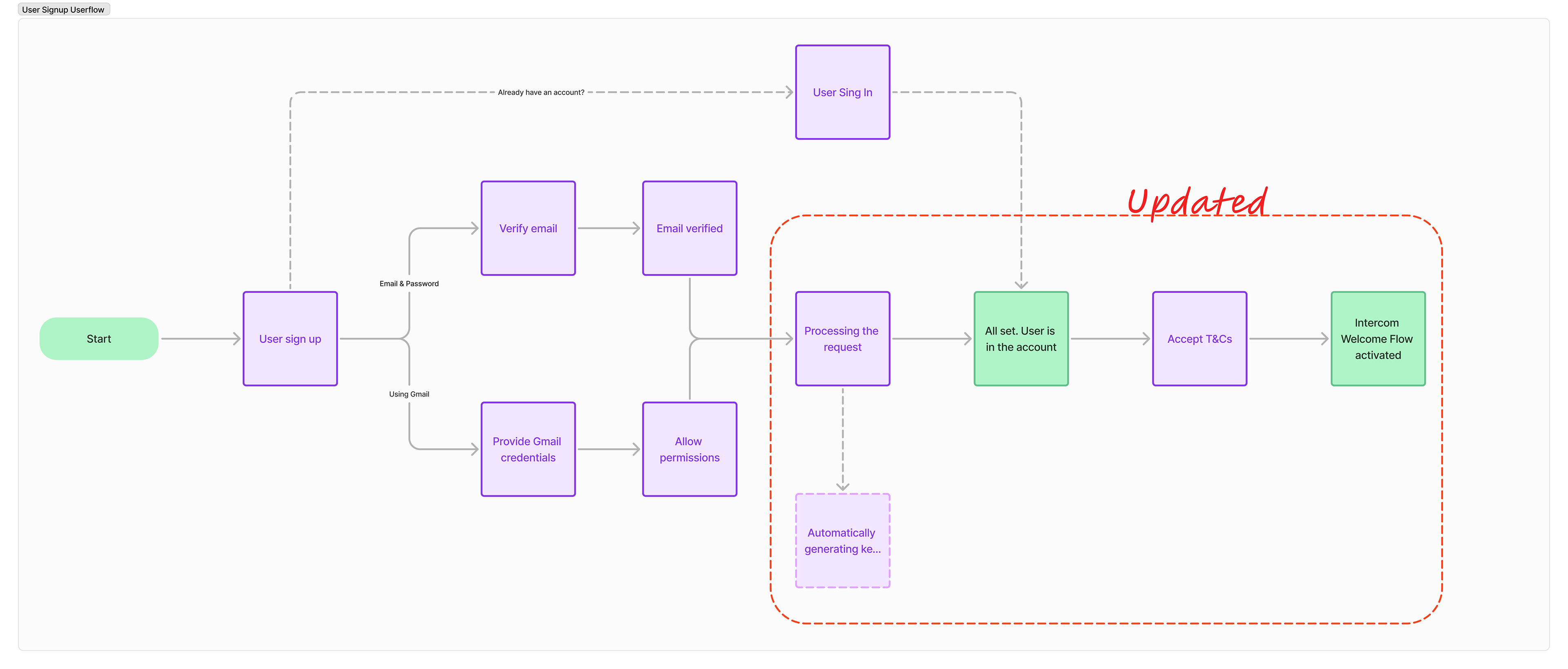
Updated User flow
Result
The results were promising. There was significant reduction of user's dropping off from the beginning and the goal was achieved in timely manner. However, still some are dropping off, a little more than expected, but not that many. We knew this might happen, hence the next phase of implementation was to have onboarding information after the signup process completion at the later stage to achieve the final business objective and user experience.